Celebrating the contribution of women over 50 to the UK insurance industry

Addressing the intersectionality between gender and ageism
Inspired by the MotherWorks, CorporateQueer and 56 Black Men photography series we plan to photograph 50 women over 50
from across the UK insurance industry and exhibit the images and biographies from June 2022.
Brand colours
The 50 over Fifty colour palette was designed with the service offerings in mind. We established a tangerine and teal to be used for typography and block backgrounds and has enough contrast to go with the paler accent colours.
Tangerine - black - pine - teal - pale teal - cloud
Thoughtful & consistent
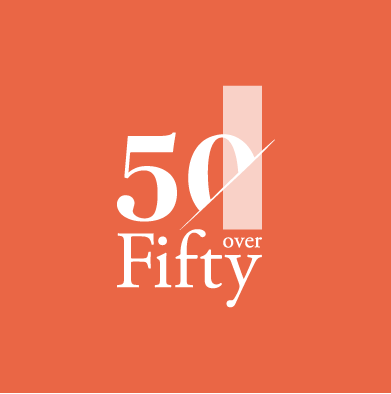
The 50 over Fifty logo mark is a combination of a strong icon in the shape of a number 50, made up of a sliced ‘0’ with a ribbon, and the logotype. The number 50 is balanced on top of the word ‘Fifty’ with the ribbon connecting the word ‘over’. 50 over Fifty commands an authoritative and expert voice yet is warm, with the use of orange and promotes nurturing and growth with the teal shades.
Abstract geometric shapes can be used to create frames for presentations, posters and other marketing material as well as stand alone shapes for calls to action, stickers and buttons.

50 over Fifty’s aim is to shine a spotlight on the great work being done by women, of all levels, who are over 50 – a section of the UK workforce whose talent and experience is often overlooked and under championed.
We created a smart website to showcase the campaign and future exhibition
We also created a slick keynote presentation


