PRS offer comprehensive mental and physical course for students aged 15-18, instilling positivity and resilience
Since PRS is a start-up we kicked off this brand process with a comprehensive brand workshop. This included coming up with a name that would work for schools as well as students and their parents. We designed a unique identity concept as well as colour scheme and a reliable font to make the brand stand out. The brand toolkit also included a set of icons, a keynote presentation as well as a brochure.

PRS are the only kind currently on the market.
A one-day course that aims to prepare children for the world outside the gates, setting them up psychologically for the risks, tests and tumbles of early adult life.
We created a flexible brand toolkit for use in marketing, keynote presentations as well as course material.

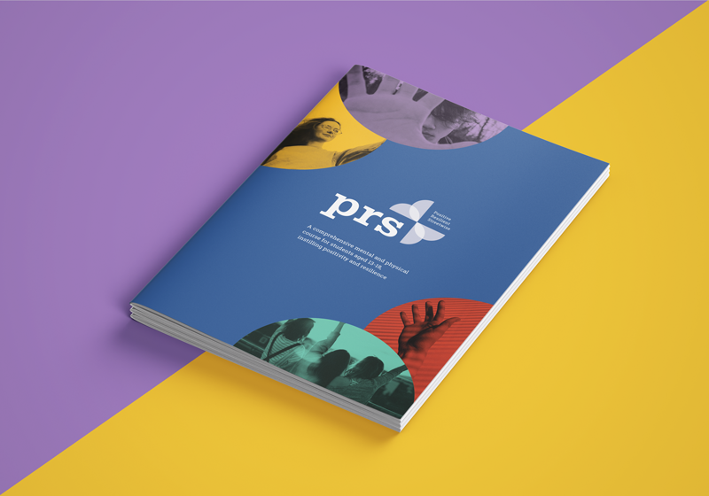
The PRS logo is a combination of a strong icon made up of four colourful semi circles, prs in a strong slab serif font and the tagline. The semi circles make up the shape of a geometric butterfly signifying metamorphosis and freedom. The slab serif font was chosen for its authoritative and grounded look. The colours are fresh, vibrant and youthful.

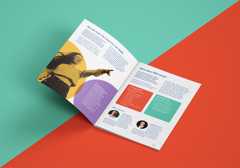
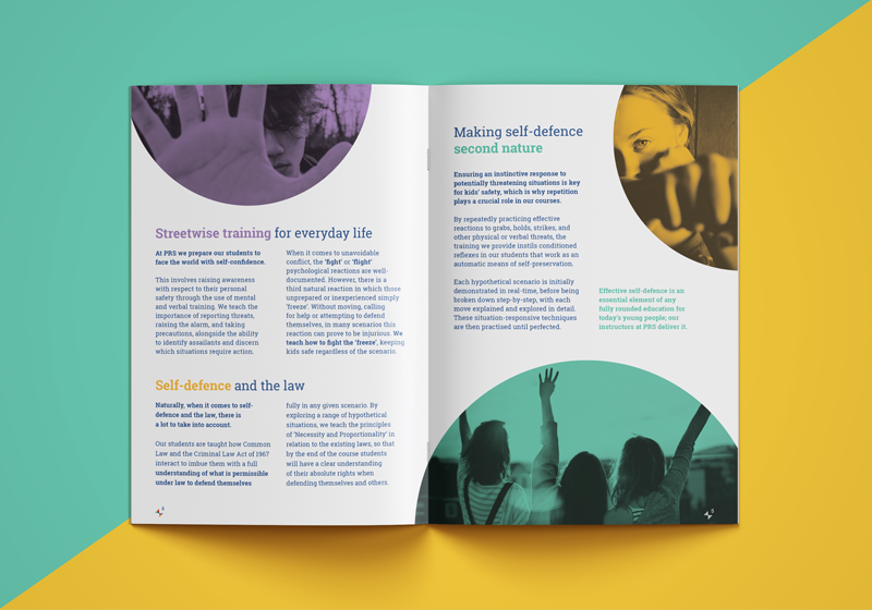
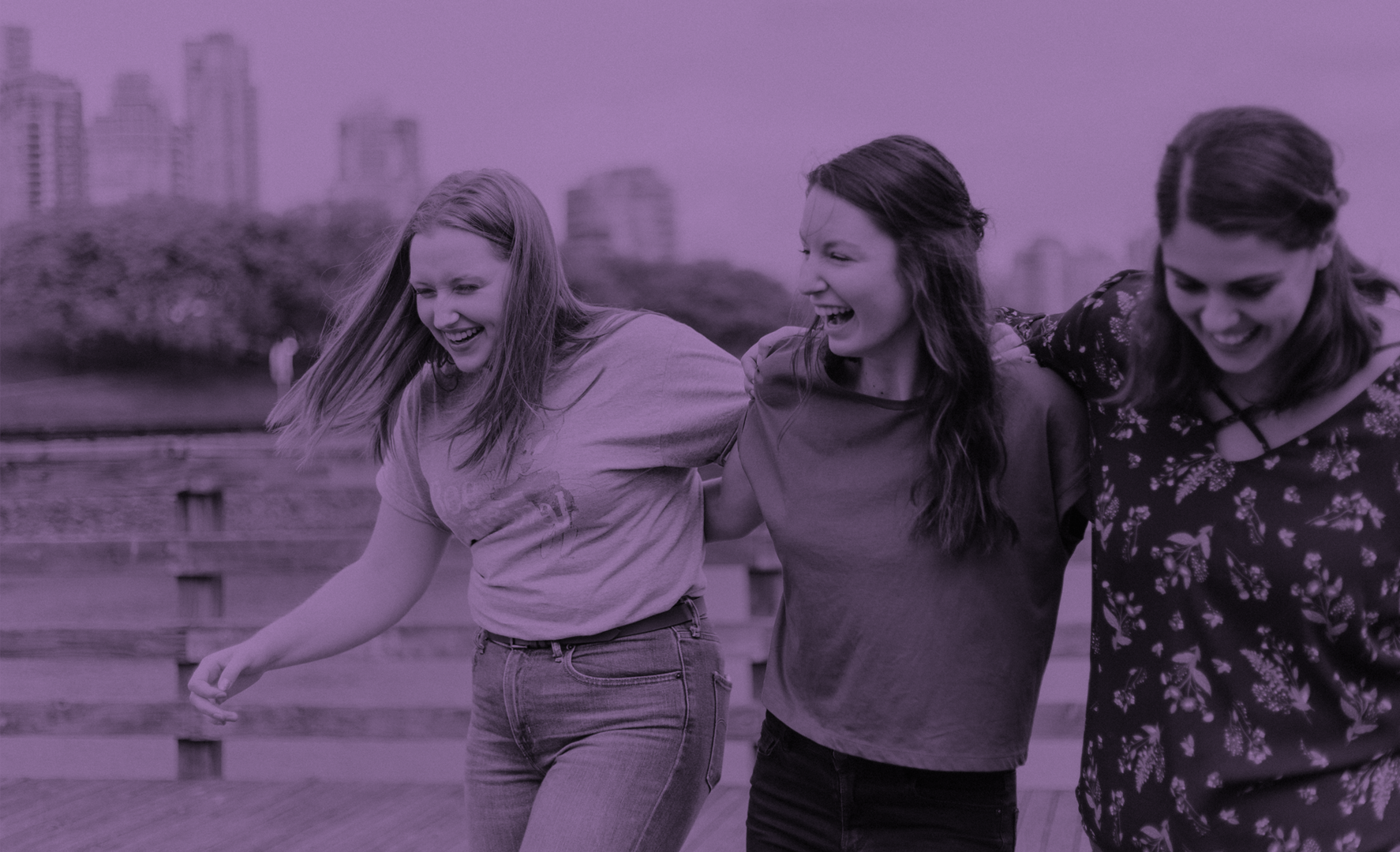
As part of the design process carefully selected a series of images to go on their web site, brochure as well as presentation deck. We made these duotone with the brand colours to make them stand out.


The PRS course is based on over 50 years worth of combined experience teaching martial arts and working in the security industry.
Awareness
Conceptual framework
Food for thought
Physical security
Resilience
Streetwise
Verbal and physical management
Self defence
positive - resilient - streetwise


Designed by No Problem IT using our brand toolkit